The Rental Mobile Operations apps interfaces vary depending on the device used.
Devices can be:
Tablet (large mobile device)
Mobile phone (small mobile device)
Laptop (Windows device)
Browser on any of these devices
Note
For the best experience, you are advised to use the Power Apps mobile app instead of a browser.
This topic explains the main interface variations. For more information, refer to:
Taskbar or floating action button
Depending on the device, the page actions are shown differently.
Mobile device
On a mobile device, to access the page actions, tap the floating action button.
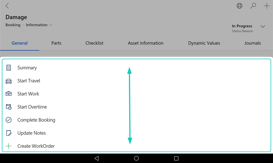
Note
If not all actions are visible, you can scroll the menu by swiping up or down.
Windows device or browser
On a Windows device or in a browser, the page actions are shown on a taskbar.
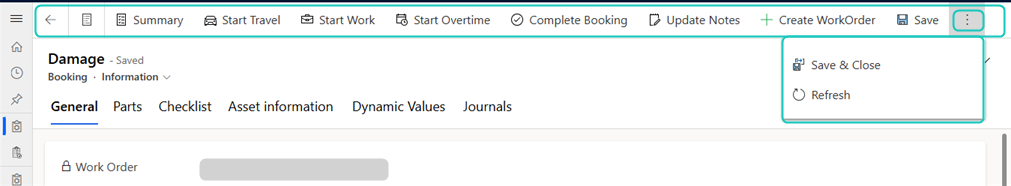
Note
Depending on the screen size, the page actions may be partially placed within an overflow menu, accessible via a [⋮] or [...] button on the taskbar.
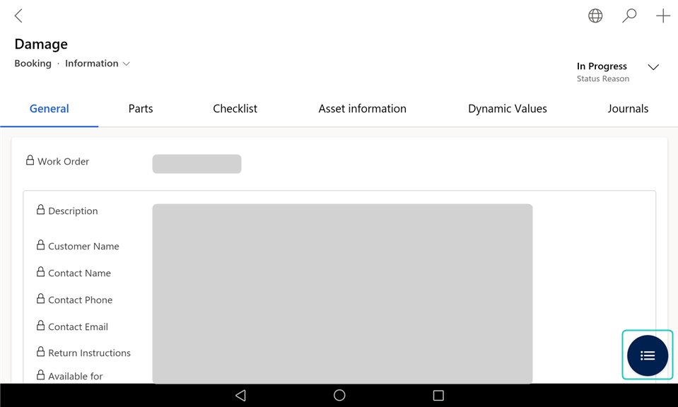
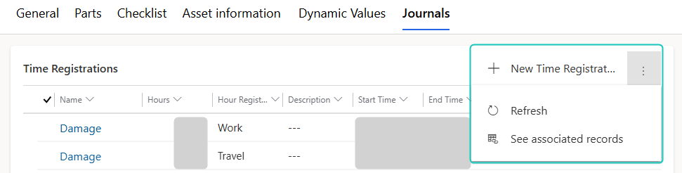
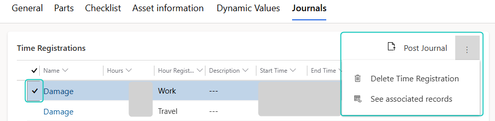
Grid or list
Depending on the device, the sections with several lines are shown differently.
Large mobile device, Windows device, or browser
On a large mobile device (for example a tablet), a Windows device, or a browser, line sections are shown as a grid.
The actions for:
The section are shown in the section header.
Selected lines are shown in the section header.
Note
If a line is selected, the section actions are not shown.
Note
Depending on the screen size, the section or line actions may be partially or fully placed within an overflow menu, accessible via a [⋮] or [...] button.
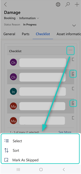
Small mobile device
On a small mobile device (for example a mobile phone), line sections are shown as a list.
The actions for:
The section are included within an overflow menu on the section header, accessed via a [⋮] or [...] button.
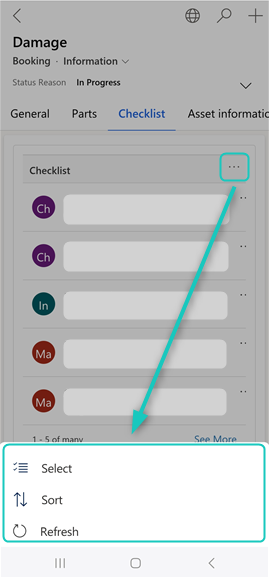
Each individual line are included within its own more options menu, accessible via a separate [...] button next to the item.
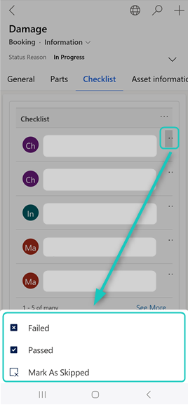
Selected lines are included within an overflow menu on the section header, accessed via a [⋮] or [...] button.
Note
To select lines, on the section overflow menu, tap Select, and in the list select the desired lines.
Documentation approach
This documentation is based on the large mobile device (tablet) layout, which most users will use. If you use a small mobile device, a Windows device, or a browser, some UI elements can appear differently. These variations are noted throughout the documentation.