The Rental Mobile Operations apps interfaces vary depending on the device used.
Devices can be:
This topic explains the main interface variations. For more information, refer to:
Depending on the device, the page actions are shown differently.
On a mobile device, to access the page actions, tap the floating action button.
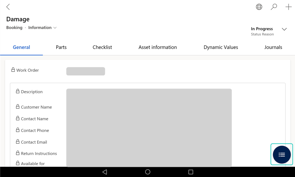
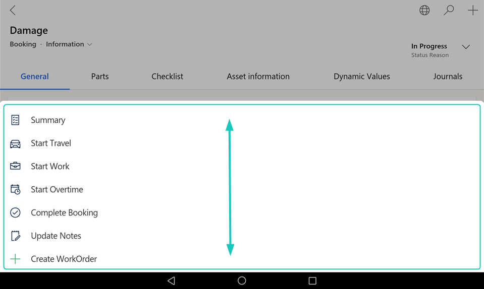
Note: If not all actions are visible, you can scroll the menu by swiping up or down.
On a Windows device or in a browser, the page actions are shown on a taskbar.
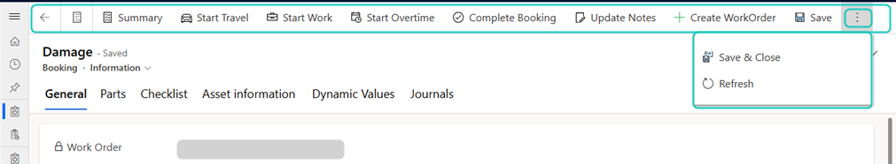
Note: Depending on the screen size, the page actions may be partially placed within an overflow menu, accessible via a [⋮] or [...] button on the taskbar.
Depending on the device, the sections with several lines are shown differently.
On a large mobile device (for example a tablet), a Windows device, or a browser, line sections are shown as a grid.
The actions for:
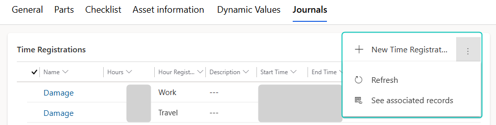
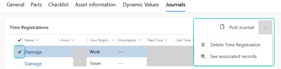
Note: Depending on the screen size, the section or line actions may be partially or fully placed within an overflow menu, accessible via a [⋮] or [...] button.
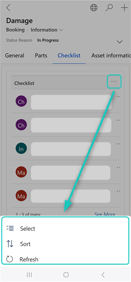
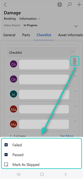
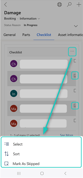
On a small mobile device (for example a mobile phone), line sections are shown as a list.
The actions for:
This documentation is based on the large mobile device (tablet) layout, which most users will use. If you use a small mobile device, a Windows device, or a browser, some UI elements can appear differently. These variations are noted throughout the documentation.